Wretched & divine
Maker of gorgeous jewellery, Kelly started the business of her dreams in 2022 and got in touch with me to create a fitting brand. With clear intentions in mind, we sat down and brought her ideas to life. Kelly has since expanded her business and now also provides alteration and repair services for clothing.
services
Visual Identity Design
Deliverables
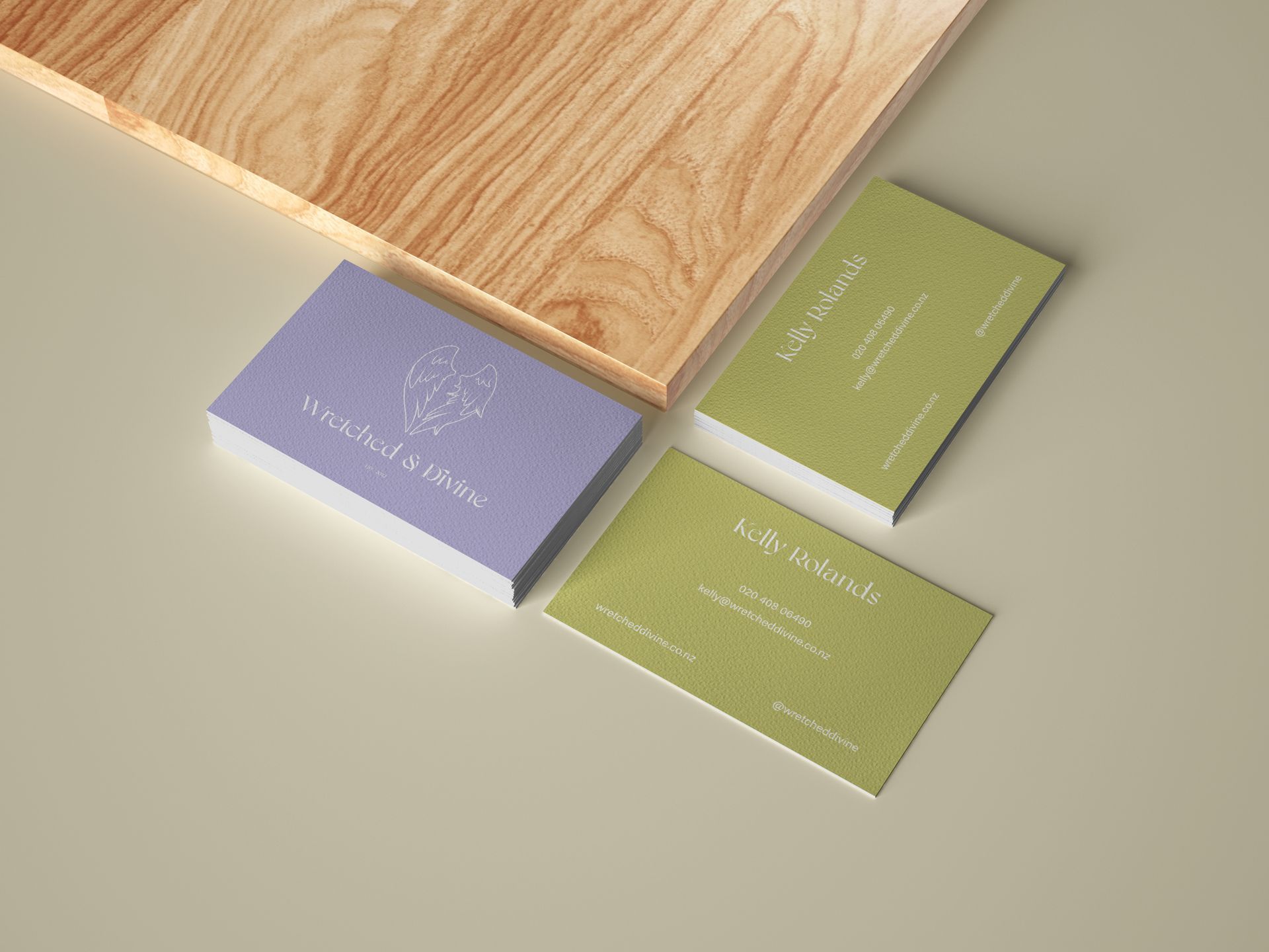
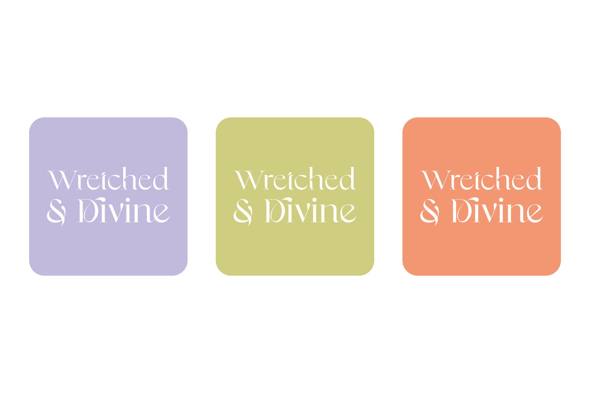
Logo | Marketing Materials | Packaging Design
The Brief
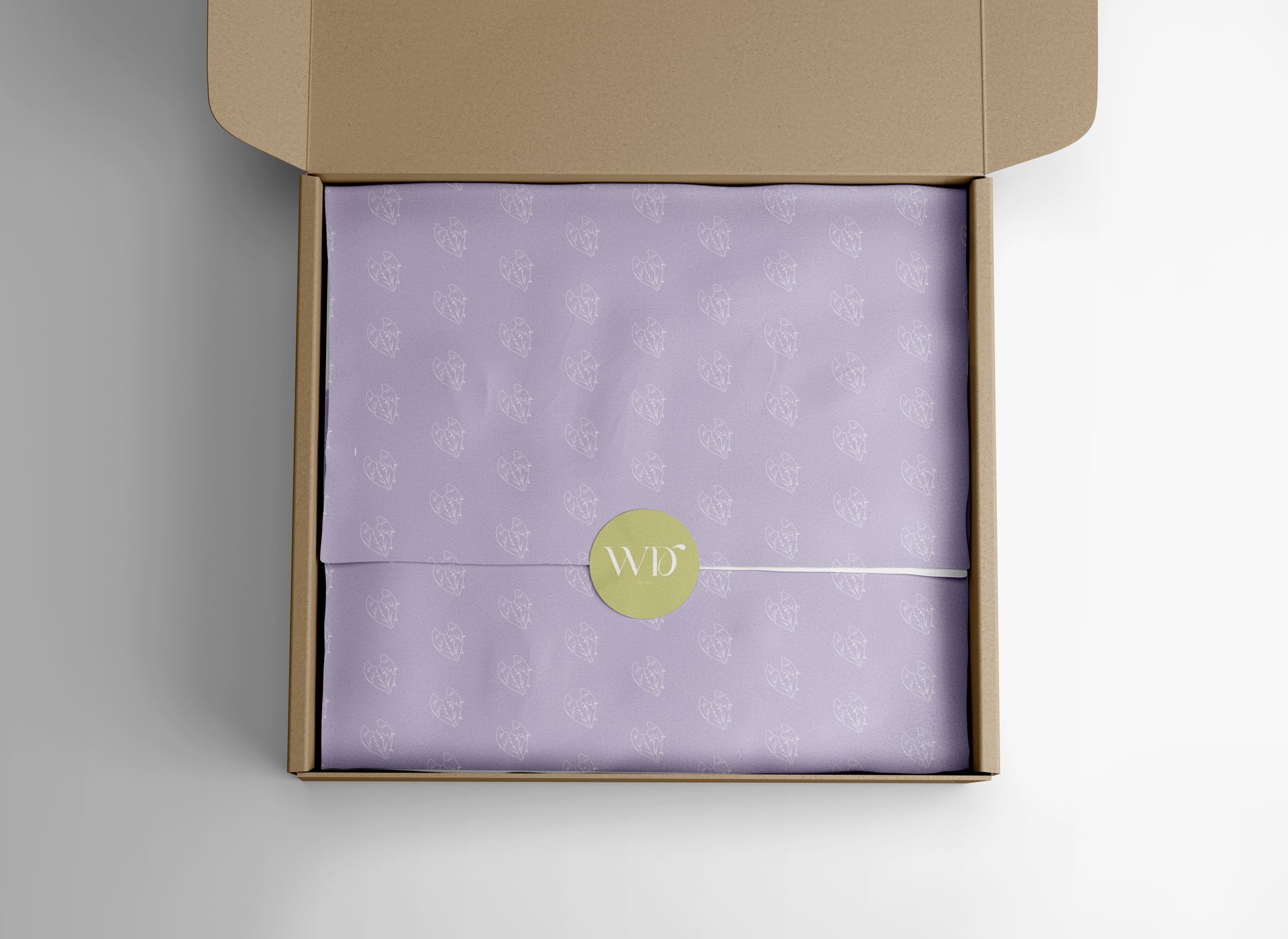
Something as personal to people as jewellery requires a brand that communicates that feeling, something Kelly understood well. With an idea in mind, Kelly and I sat down to discuss and explore. In addition to a logo and other visual identity elements, Wretched & Divine also needed packaging designed which, for jewellery especially, comes with its own challenges.
A Uniek Solution
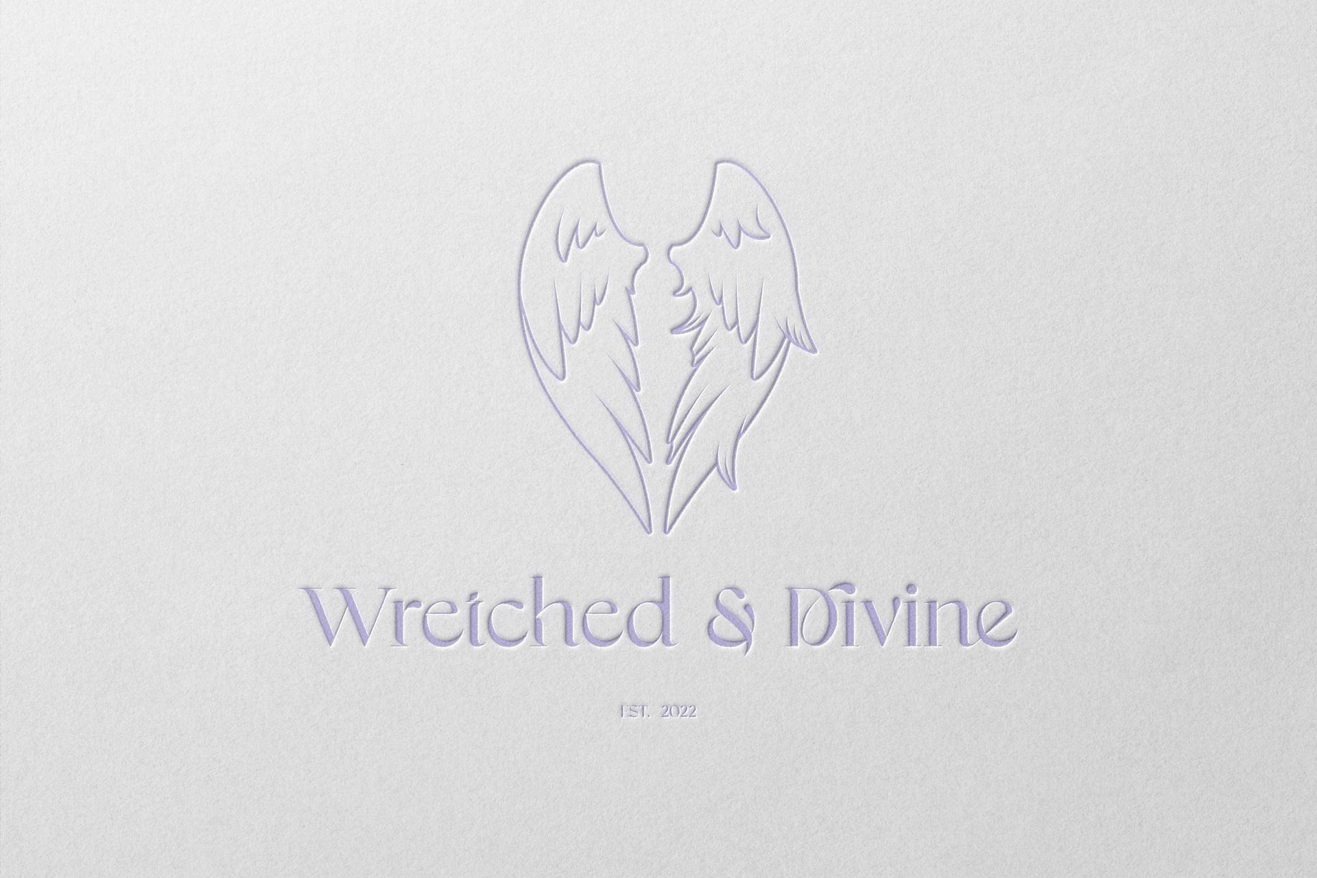
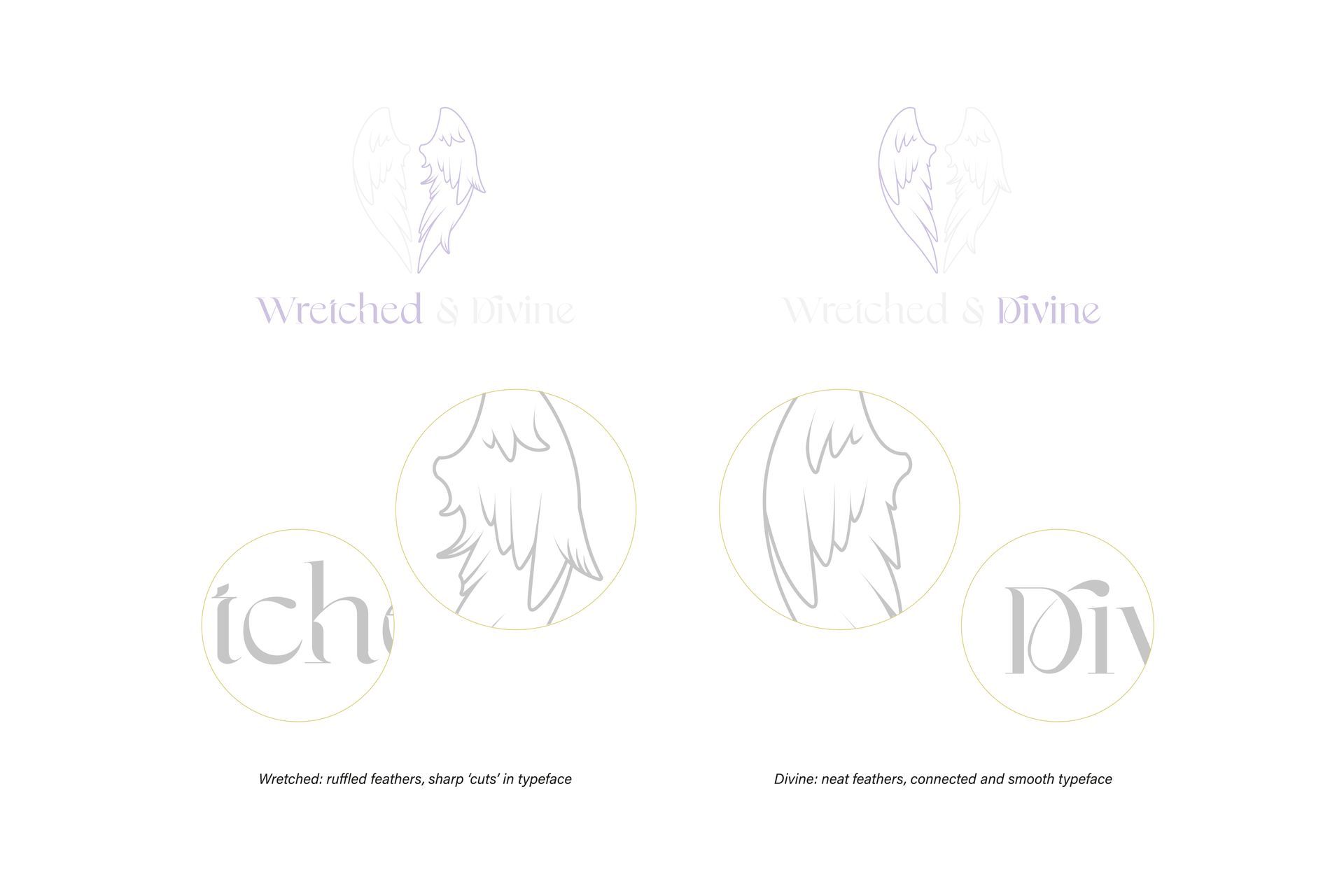
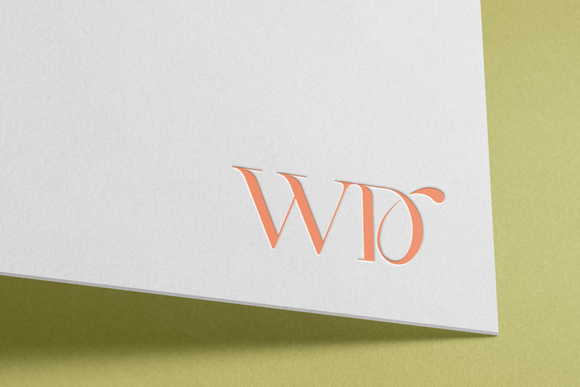
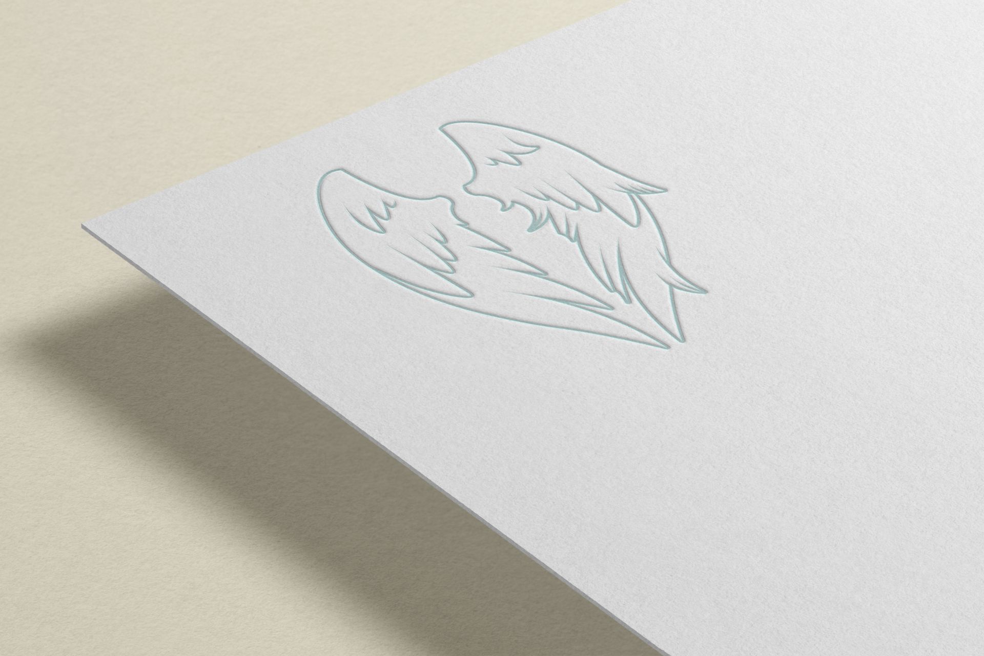
Kelly had a very clear concept in mind for her logo which was the name and angel wings. I wanted to make sure that the contrast that resides in the name would shine through in the execution of the logo while maintaining a level of elegance to suit the products.
Above and opposite to the words Wretched & Divine, is a pair of wings - one with neat feathers and the other with ruffled feathers. This depicts that even within the most beautiful, something grim hides. And within the wretched is always something divine to be found. This is further explored in the logo type where I altered an existing type to create the same distinction.
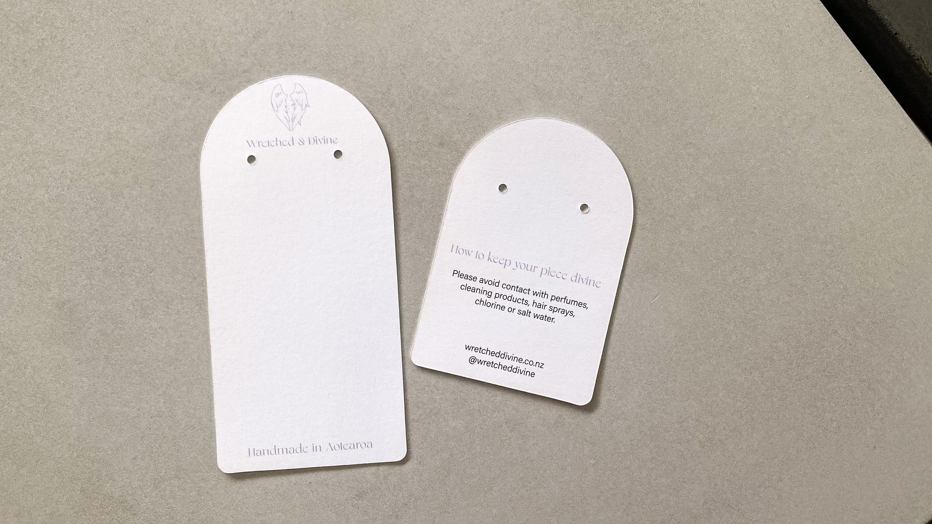
Finally, working with a commercial printer to create custom jewellery cards was a very exciting part of this journey. We landed on a simple yet stylish design that suits this brand nicely. Together with the other packaging elements, they keep the pieces divine.